
A proposal on Comic Sans (out in the open)
I was thinking about constructing some guidelines on how to use Comic Sans as if it were a proper typeface. I still believe something like that could work, but somewhere around eight this night I got fed up doing whatever I was doing and decided to go in for the kill.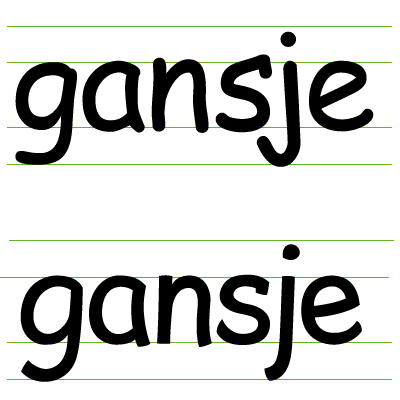
Yup — this little gander ('gansje' in Dutch) is going straight on the air. It is a first and shaky attempt to actually conceptualize a typeface that could make a worthy contender against the Comic.
Ok. I am aware this will need some serious thinking. — First of all, if I ever were able to make such a typeface, mine will never be as widely available as the Comic Sans. It will never be as popular just because of that reason. Second: I am not an experienced type-designer and many have gone before me in designing a Comic-like or rounded script typeface.
I guess I consider this a thinking process rather than a proper typefoundry-style project. Because from a designers' point of view I don't really need to make this font. Yet when time upon time I come accross these home-made newsletters, invitations, even death letters set in this apparently appealing face, I ask myself why I actually find this so strange and what I would do to change it.
Let us suppose that we have a university professor setting a text book he or she wrote in Comic Sans. Consequently making it freely available for his students as a pdf-document. What could I as a designer do (or rather: have done) —apart from designing the actual book— to improve its legibility and look?
I realize this first attempt needs a lot of work. But let's experiment...
posted by Jezusprins Achilles at 12:13:00 am
![]()


1 Comments:
Wow! That looks quite sweet! I wonder why no one ever thought about a redo before, at least I've seen no proposals before…
Post a Comment
<< Home