Thursday, April 12, 2007

Moving

Hi everyone,

I have admittedly been somewhat sluggish on updates. Well,... I've been doing nothing whatsoever actually. I have been working on the Compromise typeface though. And a whole bunch of other new stuff.

I'm dedicating an entirely new blog to my experiment in typeface design. I'm calling it "The Compromise Sans project (formerly known as A Proposal on Comic Sans)" I added 'project' to make it sound serious + a 'project' has the luxury of being allowed to fail...
Expect updates soon on compromise.janpieterchielens.be

My entire portfolio is going online aswell (soon):
that's www.janpieterchielens.be

I'm closing this blog, so this will probably be my last post here.

Cheers and hope to see you soon!
jp

Sunday, July 02, 2006

Of Death

The 'Of Death' short is now available from my portfolio (see post above).

Saturday, July 01, 2006

Nearly one month

I'm slowly returning to a frame of mind in which I can send new posts, think of what I was doing, touch those font glyphs. Forgive me for this incoherent post, I've tons of stuff to say and do.

The official working title of my Comic thing is now "Compromise Sans". As for taking it seriously, I still have no intention of doing so. But allow me to pretend I am, it keeps the clicking and dragging in rhythm. Expect updates soon.

I'm posting the Of Death short animation above. There's been some delays with the Quicktime embedding. I think I got the hang of it now, let me know if it's playing okay. And it's be great let me know what you think...

And more. Here is some online work of finishing graphic design students at my art school, Sint-Lukas Brussels. Bieke Olemans, Moenen Erbuer, Lander Janssens. Take a look and make them famous...

Saturday, June 03, 2006

Turn off your computer!

Wednesday, May 31, 2006

Dear old Comic Sans

Comic Sans was first issued in 1995 as a screen-font for MS applications like Comic Chat and 3d movie maker. It was also added to the Windows '95 package for Internet Explorer (which is why it is one of the very few standard Internet fonts) and on Word. It was clearly a child of the popular digital explosion at the time.

Since then, computers have become a very important aspect of our daily lives. To read* how people loved Comic Sans as part of the revolution, I find truly moving.

This is something that 'better' typography will never be able to replace; the same goes for 'better' graphic design. The emotional, associative power of type or design will always surpass the qualitative power of type or design.

More so than in any other craft, art or discipline, this is vital to graphic design, because it is so substantially present in our daily lives, yet rarely perceived as being a 'creation' by one or more human beings.

So does 'quality' not really matter, if associative power is so important? — It seems harsh to respond positively to such a question, but there is some truth in there.

I think the creative quality of a piece of graphic design exists. But very important is that it also lies within the designer's power to decide what he or she wants to associate with that quality. We have the power to give new (and old) associations to new projects, products, ideas, messages, people etc. The true 'quality' in graphic design lies in the 'quality' of those new projects, ideas, etc. albeit practical, commercial, emotional, moral or philosophical.

Graphic designers have a technical and creative job to do. But I think it is much more important that they understand the context, the range of associations they are working in and for.


* This may be the pdf-document the thread on Comic Chat mentioned above refers to, the original link no longer works.
Also read Piet Schreuders on the importance of quoting in design

A proposal on Comic Sans (antithesis)


Here's the first series of lowercase (digital) sketches. Obviously without accents or any other kind of variation at this stage. — Even on this low-resolution gif you will notice that my proposal has deviated generously from the original Comic Sans. On characters like the 'f,' 'x' or 'y', more than just a little.

I still believe that —given the font is available— people could still consider it as an alternative. I hope it has kept some of the playfulness, some of the childlike writing or some of the soft egde. I just finished this, so I can't really tell yet.

I haven't used one straight line, which will make it a tough one to handle for display. On-screen useability was one of the key aspects of the original Comic Sans. I am primarily responding to the over-usage of the typeface in print, but I will have to keep this in mind.
Another problem is the weight, which still isn't consistent and (I fear) somewhat too heavy for a text font. So this may be medium or a (semi)bold version... (let's not go there)

Now. A new sheet of artboard. A sharp vector pen. Onto the bigger fellas... and into a proper font program.

Sunday, May 28, 2006

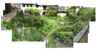
As seen from above (spring weekends)

Friday, May 26, 2006

A proposal on Comic Sans (making a font)

I love this blog. – In any other case I would have given up on this project. This journal keeps the experiment together. Anyway, here's the next step.

I decided to get to work on this. One crucial set of letters I hadn't touched yet were the b, d, p and q. Before I had slightly increased the x-height, so as to open up the shapes, which resulted in the cute shapes below.

Having introduced the 70s flared trousers look on the lowercase n, I felt they had to have the same playful feel. The ascenders and descenders bend slightly inwards. This causes a distortion in the counter shapes. That in itself is no problem, it refers to the lowercase a.
I say cute, that doesn't mean I agree with them. They seem to be darker (denser), which could make their interaction with the other characters difficult. Another thing I'm worried about is their static look. If you look at the 'de' combination, the two letters have trouble interacting as the e seems much more dynamic.

I can only be sure of these two problems when I have enough characters to set a paragraph of text. It really depends on how quirky I want to make the font. So I will definitly have to decide between very different versions.

Some great work

Instead talking about myself all the time, I think these guys are great. But before you go there: a lot better than their actual portfolio, is the Hillman Curtis documentary.

A proposal on Comic Sans (no no no)

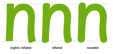
I thought I was going somewhere with the lowercase n, so I took it for a spin. I dreaded doing this, but it had to be done: the issue of rounding.

The childlike shapes in Comic Sans are very often a consequence of being rounded wherever there are serifs in serif-fonts. Because the rounding is so characteristic, I feared my experimental font would require the same rounded edges.

Now obviously, it is up to me. — In the example above, it's astonishing to see how quickly a typeface takes on a Comic-like appearance. Another thing I noticed is the difficulty created regarding the baseline. While in the 'slightly inflated' version, the character firmly 'rests' on the baseline; the rounded version seems to float in mid-air. Taking this into account, I think it's clear I'll have to go for the slightly inflated version, as —again— our font will have to be useable in larger amounts of text. Floating characters would cause the type to dance, one of the annoying features of Comic Sans.