Friday, May 26, 2006

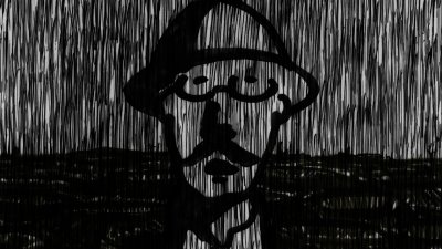
A proposal on Comic Sans (making a font)

I love this blog. – In any other case I would have given up on this project. This journal keeps the experiment together. Anyway, here's the next step.

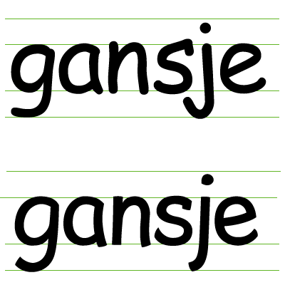
I decided to get to work on this. One crucial set of letters I hadn't touched yet were the b, d, p and q. Before I had slightly increased the x-height, so as to open up the shapes, which resulted in the cute shapes below.

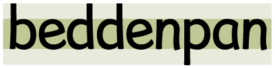
Having introduced the 70s flared trousers look on the lowercase n, I felt they had to have the same playful feel. The ascenders and descenders bend slightly inwards. This causes a distortion in the counter shapes. That in itself is no problem, it refers to the lowercase a.
I say cute, that doesn't mean I agree with them. They seem to be darker (denser), which could make their interaction with the other characters difficult. Another thing I'm worried about is their static look. If you look at the 'de' combination, the two letters have trouble interacting as the e seems much more dynamic.

I can only be sure of these two problems when I have enough characters to set a paragraph of text. It really depends on how quirky I want to make the font. So I will definitly have to decide between very different versions.
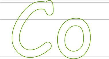
Some great work

Instead talking about myself all the time, I think these guys are great. But before you go there: a lot better than their actual portfolio, is the Hillman Curtis documentary.

A proposal on Comic Sans (no no no)

I thought I was going somewhere with the lowercase n, so I took it for a spin. I dreaded doing this, but it had to be done: the issue of rounding.

The childlike shapes in Comic Sans are very often a consequence of being rounded wherever there are serifs in serif-fonts. Because the rounding is so characteristic, I feared my experimental font would require the same rounded edges.

Now obviously, it is up to me. — In the example above, it's astonishing to see how quickly a typeface takes on a Comic-like appearance. Another thing I noticed is the difficulty created regarding the baseline. While in the 'slightly inflated' version, the character firmly 'rests' on the baseline; the rounded version seems to float in mid-air. Taking this into account, I think it's clear I'll have to go for the slightly inflated version, as —again— our font will have to be useable in larger amounts of text. Floating characters would cause the type to dance, one of the annoying features of Comic Sans.

A proposal on Comic Sans (kindred spirits)

I found a Comic kindred spirit online. — Be sure to check out the entire blog network, it seems a refreshing alternative for Blogger.

Thursday, May 25, 2006

Workloads, workloads,...


I'm not just a crazy typographer spending too much time on Comic Sans. — In fact, and this is a school project of mine, I'm working on a six-minute animation right now. As I still try and entertain myself with some kind of social life, this has offically classified me amongst those who never sleep. Or at least those who go to bed at six in the morning and get up way too early.

And things get worse. I decided to take up this blog, just so as those remaining empty minutes of the day are filled with writing long journals to people I have never met.

Anyway — about this animation thing. It's a six-minute monologue by Ivor Gurney, a first world war poet and composer that lost his sanity and died in an asylum in 1937. I'm trying to construct a mental biography of the man with his poem 'Of Death.' It's pretty disturbing and impenetrable material, making the whole project very personal.
It's quite the opposite of my Comic Sans thing, so I thought it would make a nice change to put on the blog.

I'm sure I'll find a way to put it in an online portfolio at some point, so you can all take a look.

A proposal on Comic Sans (let's get serious)

So what did I try to do last night? — The morning-after feeling isn't that bad. These first sketches seem to work, to some degree at least. — Please note that I never even touched the Comic-glyphs. These shapes I made from scratch, which explains why they sometimes are a bit messy. And that this is a completely new font, not a Comic Sans copyright violation.

What is so wrong with Comic Sans, knowing it is used in large bodies of text, as titling, on both print and screen?

First of all. Its fake cartoony-ness to begin with. Almost every glyph in the font has got rounded 'bits' sticking out to make them look pen-scribbled. — I decided not to have those.

Second. The weird contrast. Comic seems monoline, but isn't. If you look at the upward curve of the a or the 'cracked' s, there is some variation. — For the time being I'll get rid of the monoline feel and increase the contrast slightly.

Third: round edges. I am aware that the round edges make the Comic Sans playful or funny — and therefore popular. So I will probably have to keep them. Nevertheless, I think a version with slightly inflated straight edges could work very well.

Four: the size-differences. It is quite easy to notice that the Comic doesn't really take the x-height seriously. Because this font is used by so many as a text-font, I'm afraid that's something that will have to go.

A proposal on Comic Sans (out in the open)

I was thinking about constructing some guidelines on how to use Comic Sans as if it were a proper typeface. I still believe something like that could work, but somewhere around eight this night I got fed up doing whatever I was doing and decided to go in for the kill.

Yup — this little gander ('gansje' in Dutch) is going straight on the air. It is a first and shaky attempt to actually conceptualize a typeface that could make a worthy contender against the Comic.
Ok. I am aware this will need some serious thinking. — First of all, if I ever were able to make such a typeface, mine will never be as widely available as the Comic Sans. It will never be as popular just because of that reason. Second: I am not an experienced type-designer and many have gone before me in designing a Comic-like or rounded script typeface.

I guess I consider this a thinking process rather than a proper typefoundry-style project. Because from a designers' point of view I don't really need to make this font. Yet when time upon time I come accross these home-made newsletters, invitations, even death letters set in this apparently appealing face, I ask myself why I actually find this so strange and what I would do to change it.
Let us suppose that we have a university professor setting a text book he or she wrote in Comic Sans. Consequently making it freely available for his students as a pdf-document. What could I as a designer do (or rather: have done) —apart from designing the actual book— to improve its legibility and look?

I realize this first attempt needs a lot of work. But let's experiment...

Wednesday, May 24, 2006

A proposal on Comic Sans (part 2)


I just remembered this. — Accepting these people are being mildly ironic, their design still proves Comic Sans is in deep need of improvement. Worse than that, even these people do so. And they have no excuse whatsoever to resort to some kind of vernacular design. Don't hit the 'next' button if you hold your graphical taste buds dear.

Tuesday, May 23, 2006

A proposal on Comic Sans (part 1)


For years now I've been listening to this Comic Sans-abuse coming from the most polite, non-elitist designers. Typographers from all over the world lose sleep, wake up in pools of sweat and angrily curse the malevolent designer that has devised the magazine, poster —my God— even Book using the wretched font. Hate-campaigns like bancomicsans.com call out shamelessly to the masses to delete the typeface from hard drives, as if it were a virus or a sordid porno.

Meanwhile on the other side of the spectrum, some saintly pc-user on a word processor means no harm to society when he goes for the funny font on four-hundred pages of textbook. He or she will call it youtful or fresh. Or better still: welcoming; as a proof that graphic design truly works: to welcome a slothful reader into the rich realms of text, meaning and culture!

I have no intention to blow up this argument. I am no fan of the Microsoft Corporation, but I cannot deny their introduction of Comic was a direct hit. Populist as I am, I feel urged to approach the masses. There obviously is a popular need for a Typeface 'like' Comic Sans. — So instead of denying the public their favourite weakness, why do we not turn it into a strength?

Because, obviously, I care for graphic design and graphic designers. A world without insomniac typographers is a better world. — Let us improve Comic Sans!

The end of David Carson?

I just spent some days in Berlin and I'm trying to put the (much too) premature summery feeling of the place behind me. I've got work to do.

Setting up this blog right now isn't exactly what I call responsible behaviour either. Certainly considering the workload of the animation project I'm working on. But heck, if I'm going to attempt to organize myself, I might aswell do it when things are already interesting.


I sat out the three-day design conference TypoBerlin at the KulturHaus. Exhausting as it may have been, it was certainly fascinating.

I was impressed by Kalle Lasn from Adbusters, who held the opening speech. If you haven't heard about Adbusters, you should. — Witnessing a passionate anti-consumerist speech to a room full of institutionalized art directors is very inspirational. It certainly brought ideas to my mind. But more on those later.

I'm not going to go into the entire conference. It had some spectacular highlights (with people like Chip Kidd, Underware or Simon Waterfall at Poke).

I was surprisingly disappointed by world renowned David Carson. — I'd always enjoyed his freshness towards visual culture. In his presentation at TypoBerlin he seemed to have become a dull repeat of himself. I'm not quite sure why. I suspect being called the enfant terrible of a tiny subculture for too long works counterproductive.

The work, although it was sometimes visually impressive, was really a never-ending reflection of Carson's personality — rather than that of an interaction between Carson and the content he was supposed to deal with. His subjectivity had become a style, rather than a language.

I am nevertheless still tempted to agree with David Carson on the role of the designer. That of the subjective interpretor. — In Hillman Curtis' AIGA Carson short documentary, we get a very interesting viewpoint on this. — Carson tells us he wants his revolution to go on. The man rarely sounds like he takes design seriously. I think, in fact, he does very much so.
I think that revolution is one towards design as a more autonomous discipline. Certainly, in an age where newspaper design is being taken over by artifical intelligence, graphic design needs to emphasize its humanity rather than its technological resourcefulness.

Carson —not unlike print— has not really come to an end, it's just that he (or it) could really use a new beginning.

Monday, May 22, 2006

I was already arrogant before I started blogging

As so many others, I felt I had something to say. I was quite sure I did, but had no way of proving it. So: a blog. An exhibitionist's way of proving his arrogance. Or to be less severe: a place where I say stuff about graphic design, visual culture, language, society and its people.

Call it organizing my thoughts. Although in this blog-abundant time that probably is a cliché. I prefer to call it a pebbly puddle of ideas, or a filthy pool of perversity between my ears, if you want. A place where I can drop stuff, have them cool off and pick them up later.

You will notice I natively speak Dutch. But as I will attempt to write this blog for people around the world to actually read, English seems the most logical choice. — Comments are very welcome. In fact they're the whole point of the operation.

— JpDHCh