
A proposal on Comic Sans (no no no)
I thought I was going somewhere with the lowercase n, so I took it for a spin. I dreaded doing this, but it had to be done: the issue of rounding.
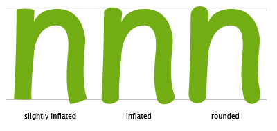
The childlike shapes in Comic Sans are very often a consequence of being rounded wherever there are serifs in serif-fonts. Because the rounding is so characteristic, I feared my experimental font would require the same rounded edges.
Now obviously, it is up to me. — In the example above, it's astonishing to see how quickly a typeface takes on a Comic-like appearance. Another thing I noticed is the difficulty created regarding the baseline. While in the 'slightly inflated' version, the character firmly 'rests' on the baseline; the rounded version seems to float in mid-air. Taking this into account, I think it's clear I'll have to go for the slightly inflated version, as —again— our font will have to be useable in larger amounts of text. Floating characters would cause the type to dance, one of the annoying features of Comic Sans.
posted by Jezusprins Achilles at 2:10:00 am
![]()


1 Comments:
jajajaajaja
its not easy
Post a Comment
<< Home