
A proposal on Comic Sans (antithesis)
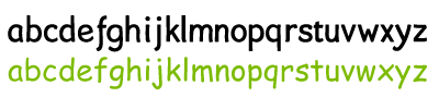
Here's the first series of lowercase (digital) sketches. Obviously without accents or any other kind of variation at this stage. — Even on this low-resolution gif you will notice that my proposal has deviated generously from the original Comic Sans. On characters like the 'f,' 'x' or 'y', more than just a little.
I still believe that —given the font is available— people could still consider it as an alternative. I hope it has kept some of the playfulness, some of the childlike writing or some of the soft egde. I just finished this, so I can't really tell yet.
I haven't used one straight line, which will make it a tough one to handle for display. On-screen useability was one of the key aspects of the original Comic Sans. I am primarily responding to the over-usage of the typeface in print, but I will have to keep this in mind.
Another problem is the weight, which still isn't consistent and (I fear) somewhat too heavy for a text font. So this may be medium or a (semi)bold version... (let's not go there)
Now. A new sheet of artboard. A sharp vector pen. Onto the bigger fellas... and into a proper font program.
posted by Jezusprins Achilles at 2:03:00 pm
![]()


0 Comments:
Post a Comment
<< Home